Research
Visual Design
UI Design
UX Design
- Figma
- Adobe Illustrator
- Adobe Photoshop
Overview
💉 Project Brief
Pill O'Clock is a mobile application designed to assist users in managing their medication schedules with reminders and notifications. The app ensures timely medication intake and provides tools for family members to monitor and support their loved ones in adhering to their prescribed treatments.
⚡ Problem
Users often struggle with remembering to take their medication on time. This can lead to missed doses, which impacts the effectiveness of treatment. Additionally, family members often need a way to track their loved one's medication adherence to provide timely reminders and support.
💡 Goals
- Ensure Timely Medication: Develop an app that reliably reminds users to take their medication on time, reducing the chances of missed doses.
- Facilitate Family Monitoring: Create features that allow family members to easily monitor and support the user’s medication adherence.
- Streamline Medication Management: Provide a simple and efficient way to manage medication schedules, refills, and track treatment progress.
🎯 Objectives
- Improve Medication Adherence: Provide consistent and timely reminders to help users take their medications as prescribed.
- Support Family Involvement: Enable family members to track the user's medication intake and send notifications if a dose is missed.
- Simplify User Experience: Design a user-friendly interface that makes it easy for users to manage their medication, track supplies, and schedule refills efficiently.
Design Roadmap
01
Emphatize
02
Define
03
Ideate
04
Design
- User Research & Empathy Mapping
- Pain Points & Needs Identification
- Competitive Audit
- User Persona
- User Flow & Journey Mapping
- Wireframes & Prototypes
- Usability Study
- Feedback & Iterative Improvements
- Brand/Visual Design
- HiFi-Prototypes & Mockups
- Color, Typography, & Iconography
Emphatize
User Research
To understand the scope of the problem, I conducted a general research study involving interviews and literature review. According to the World Health Organization's 2021 report, 15.8% of the global population relies on regular medication, with this figure expected to rise to 22.8% by 2050.
Forgetfulness: Many users forget to take their medication, leading to health complications.
Supervision: Family members need tools to monitor their loved one's medication intake and provide reminders.
All-in-One Management: Users want a centralized solution for managing medication schedules, refills, and appointments.
Competitive Audit
I analyzed several existing apps to identify gaps and opportunities:
- Target Audience: Individuals aged 18-80 who are undergoing medical treatment, and those responsible for managing the medication of family members.
MediSafe: Offers shared medication data among multiple users and provides reminders for appointments and refills.
CareClinic: Tracks medications and symptoms, allowing users to share reports with healthcare providers.
Dosecast: Provides flexible medication reminder options and cross-device data syncing.
Pillboxie: Features a virtual pillbox with color-coded reminders, including notifications even when the device is asleep.
Define
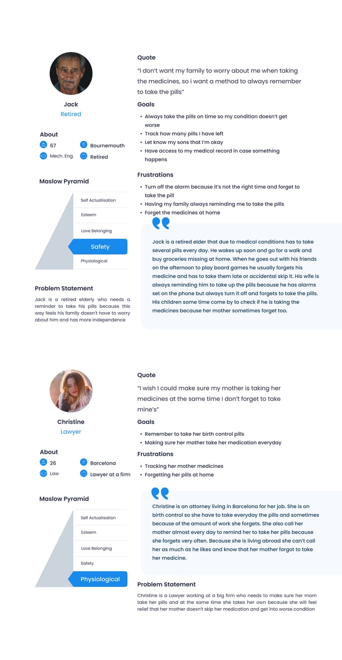
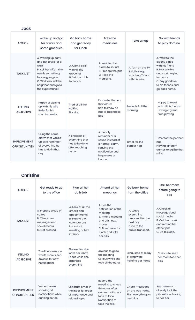
User Persona & Journey
Ideate
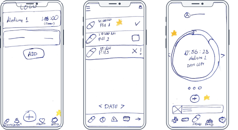
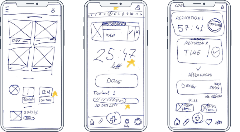
Sketches
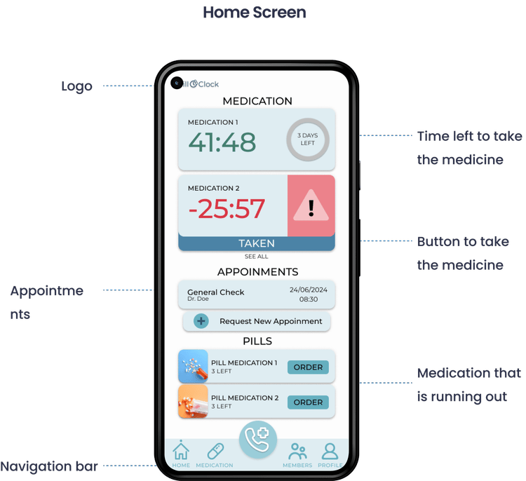
I began by sketching out the core screens of the app, with a primary focus on the homepage. This page would serve as the central hub from which users could access all key functionalities, including medication schedules, refill orders, and family member monitoring.
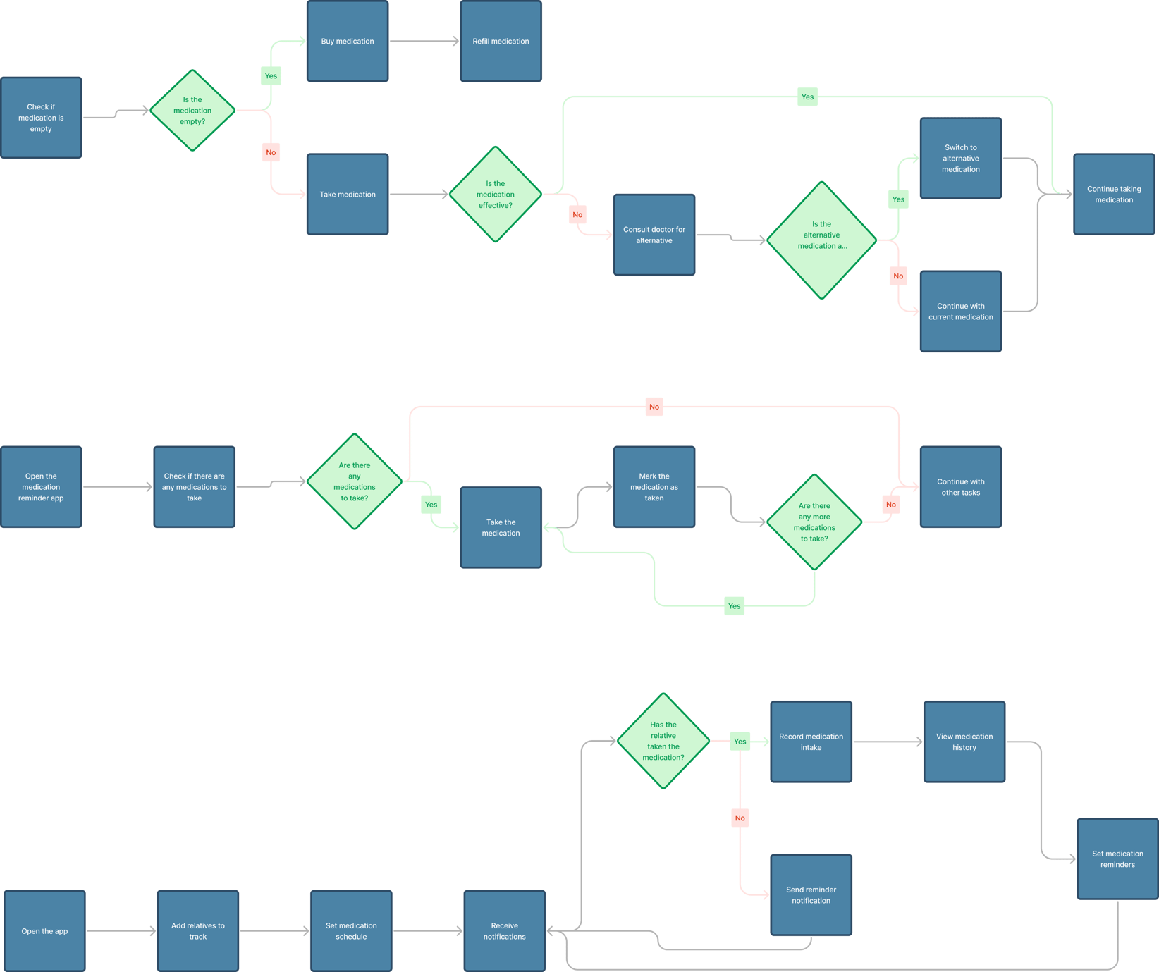
 Flow Chart
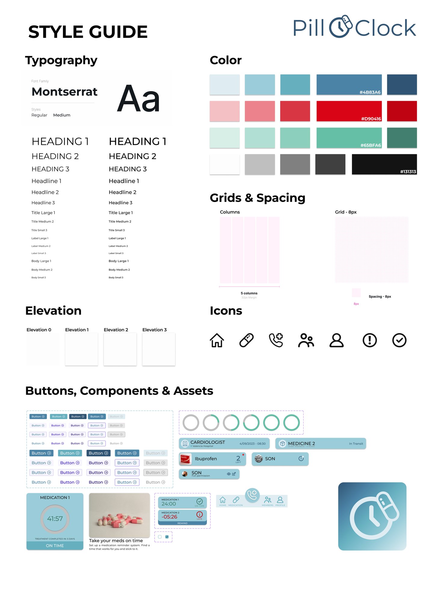
 Style Guide
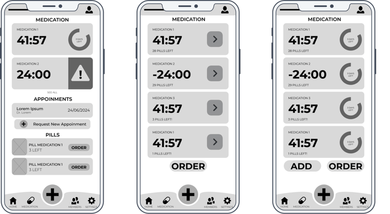
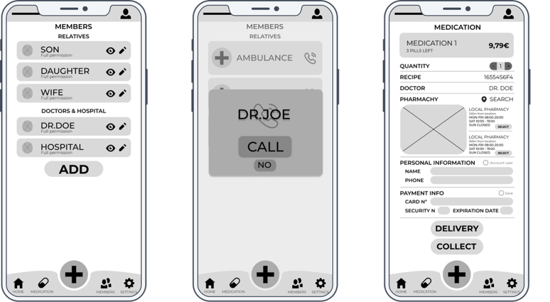
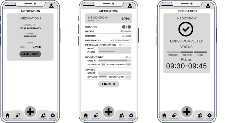
 Digital Wireframes
Transitioning from paper to digital wireframes, I prioritized user accessibility and ease of use. The goal was to ensure that all users, regardless of technical ability, could navigate the app effortlessly.
Digital Wireframes
Transitioning from paper to digital wireframes, I prioritized user accessibility and ease of use. The goal was to ensure that all users, regardless of technical ability, could navigate the app effortlessly.
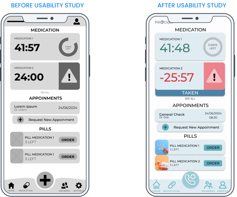
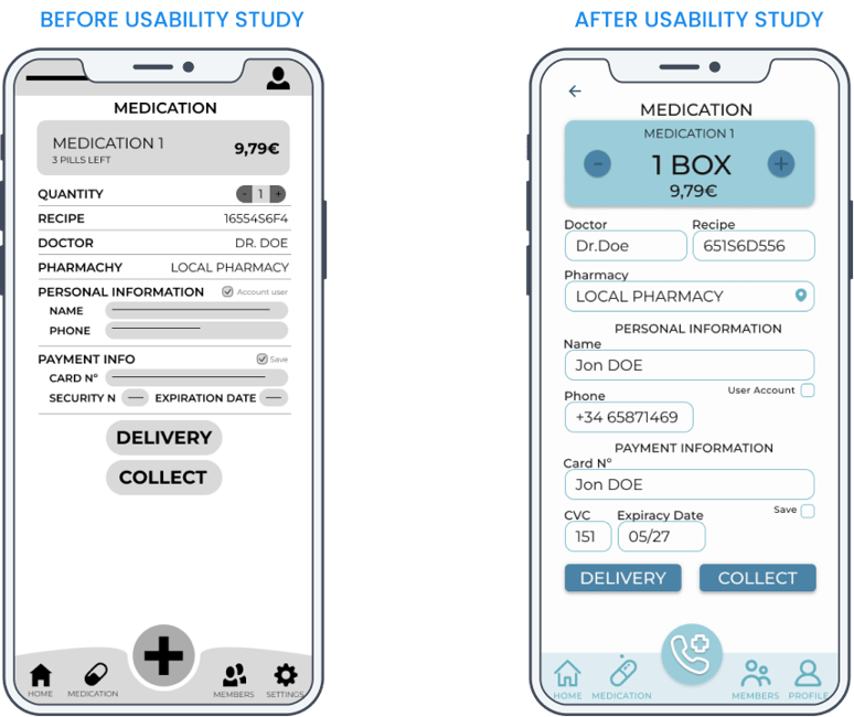
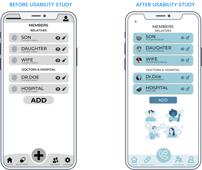
Usability Study
- Study Type: Unmoderated Usability Study
- Location: Spain, remote
- Participants: 5 Participants
- Length: 10-15 minutes
Usability Study Findings
- Checkout & Adding Medication: Users found the process unclear due to poorly indicated text fields.
- Members Section: The flow was incomplete, causing confusion about its purpose and functionality.
Design
📱 Mockups After Usability Study
Based on the usability study, I made the following changes:
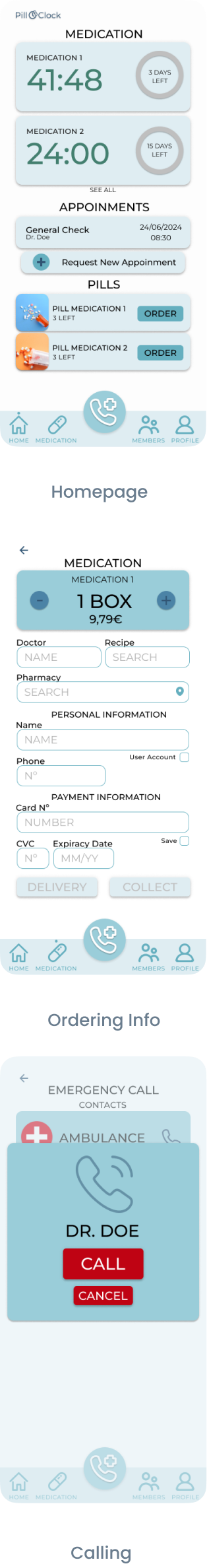
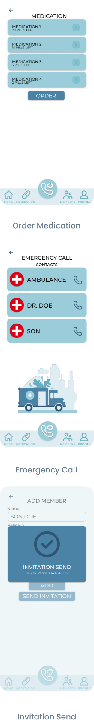
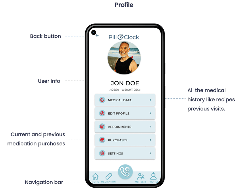
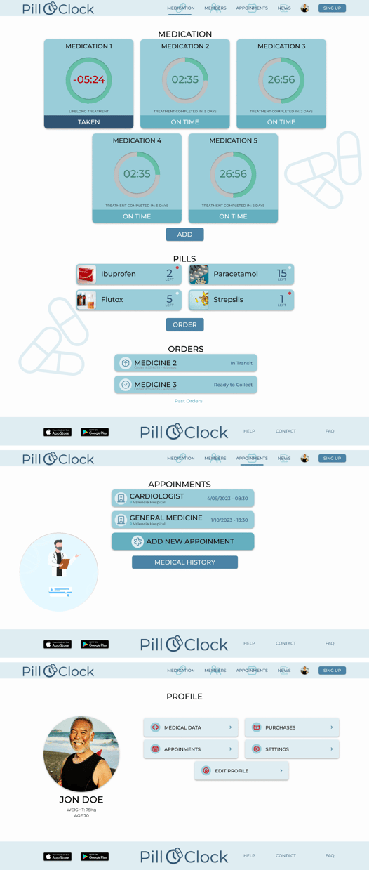
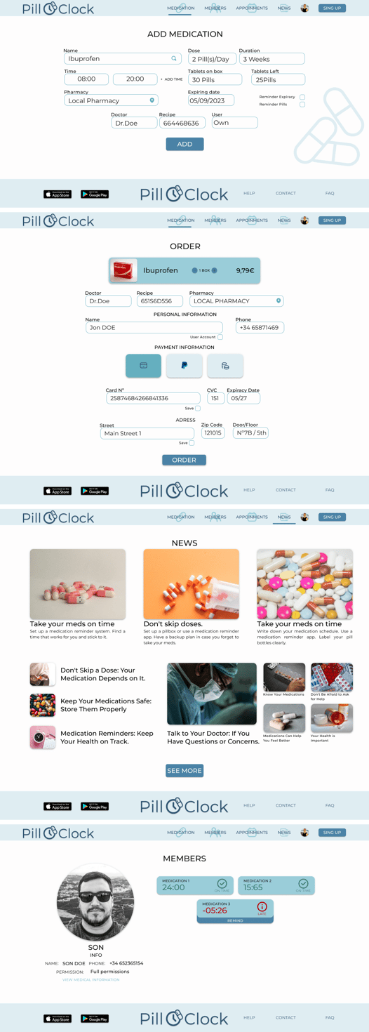
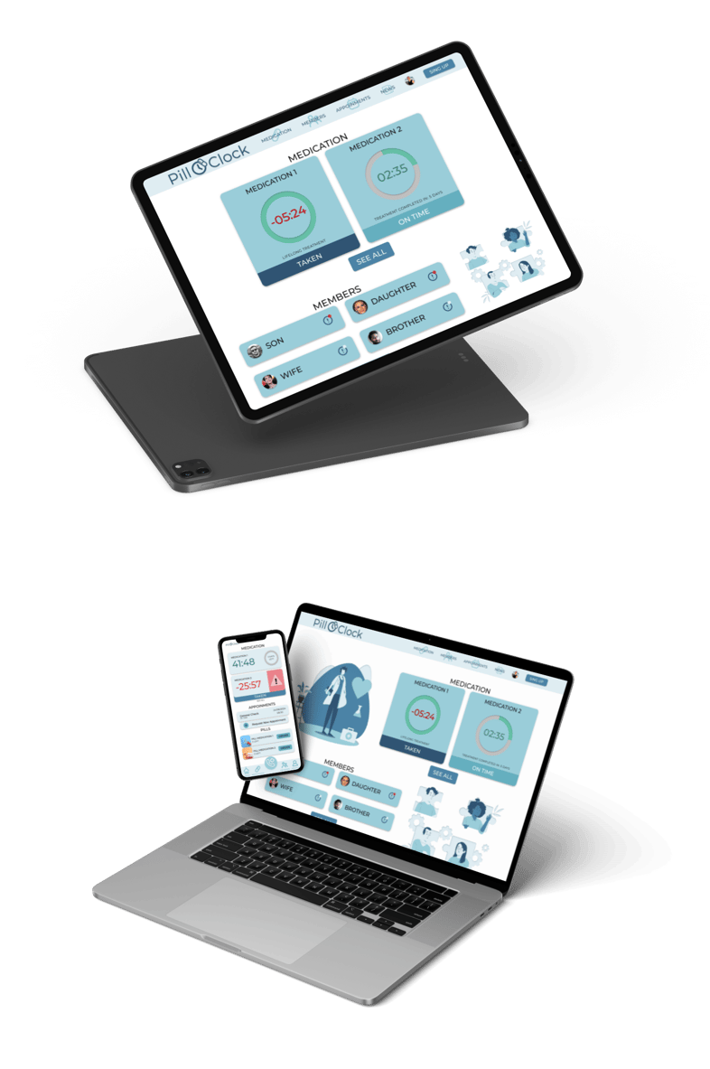
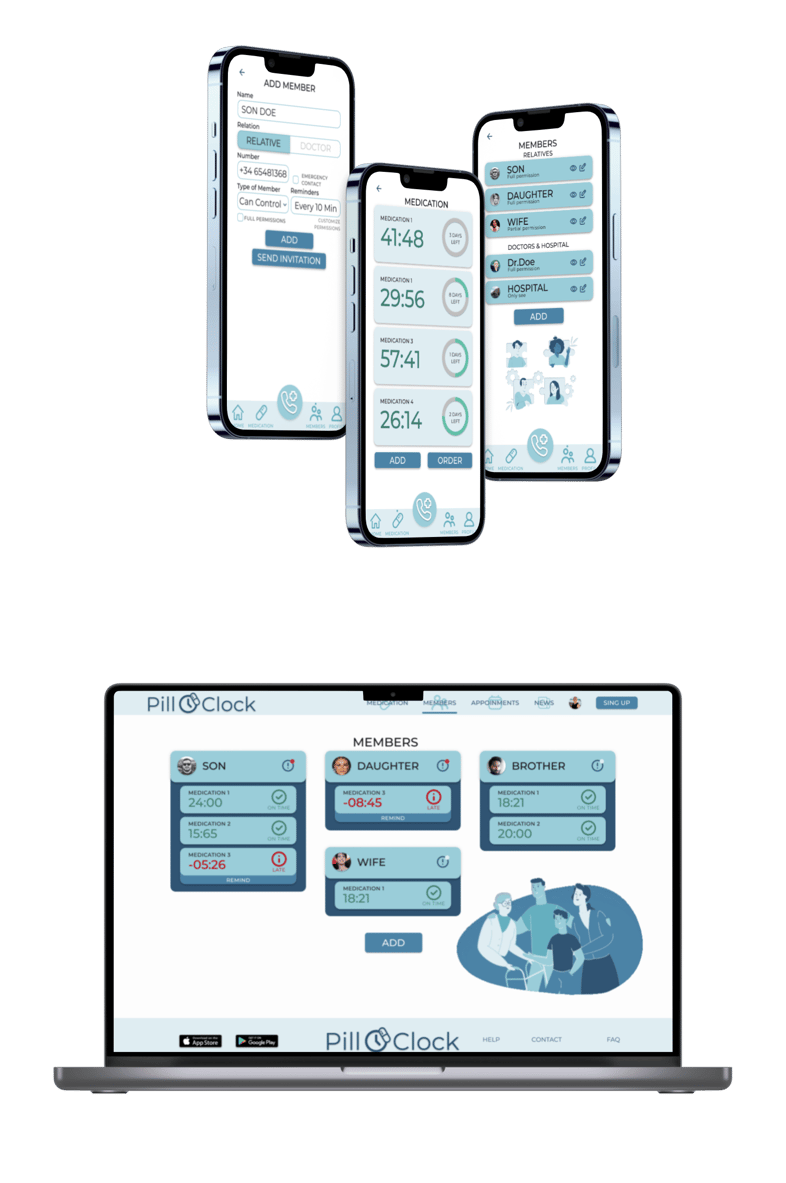
 Screens - Mobile Version


 Hi-Fi Mobile Version Prototype
Screens - Desktop Version
Hi-Fi Mobile Version Prototype
Screens - Desktop Version
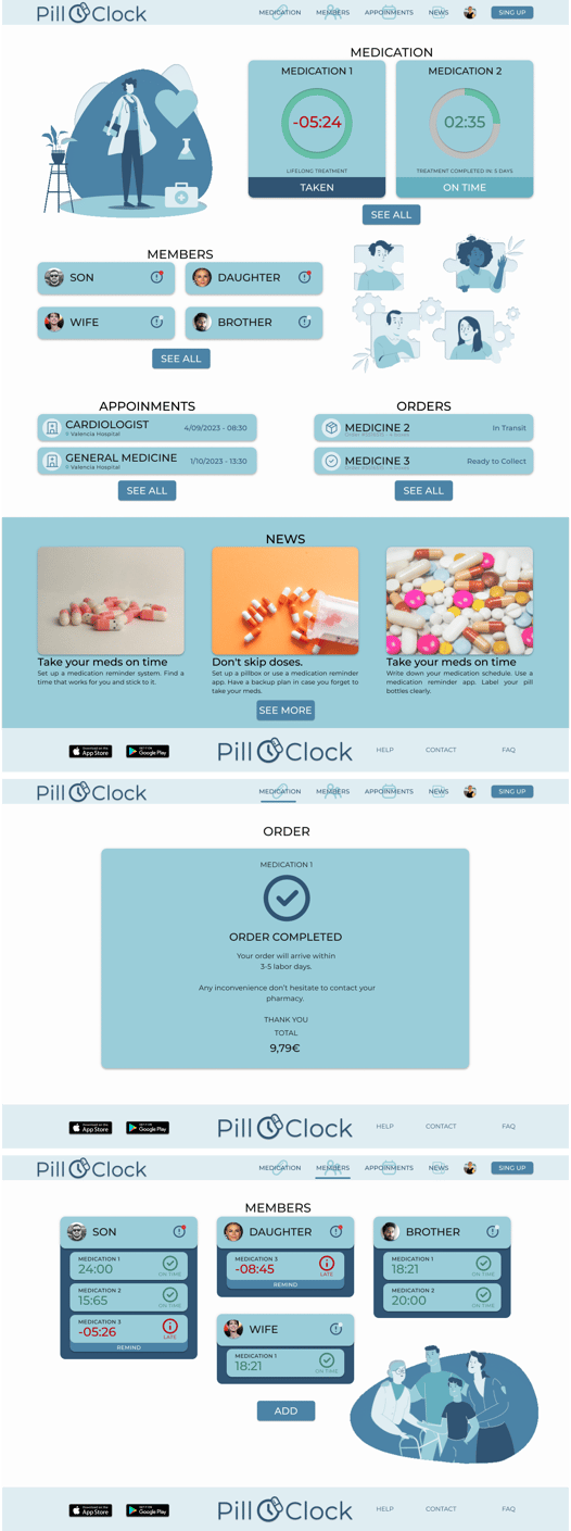
 Hi-Fi Version Desktop Prototype
- Tab Consistency: Standardized tab sizes for a more uniform user experience.
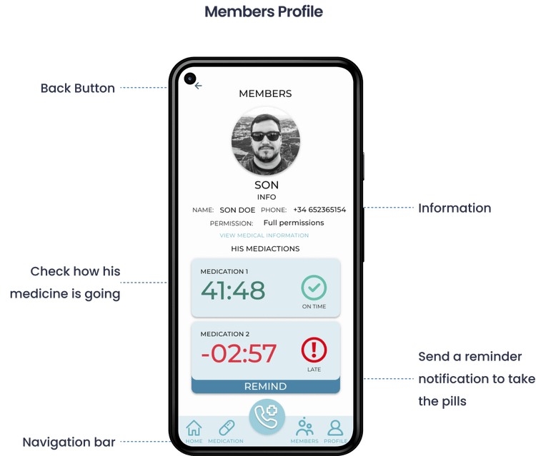
- Members Section: Completed the flow and added profile features for better clarity.
- Medication Adding Process: Simplified the flow to make it more intuitive for users.
Accessibility Considerations
🚀Takeaways
Impact: Users found the design intuitive and visually engaging, with a clear hierarchy and a rich user experience.- Enlarged elements for better navigation across all user demographics.
- Utilized throughout the app to aid navigation, especially for users reliant on assistive technologies.
- Ensured that the app works seamlessly on both desktop and mobile platforms, with specific features designed for each.
What I Learned: Even minor design changes can have a significant impact on the overall user experience. It’s essential to stay focused on the user’s real needs throughout the design process. 📈Next Steps
- Conduct follow-up usability testing on the new versions of the app.
- Identify additional areas for improvement and consider new feature ideas.
- Continue iterating on visual elements, including animations and iconography, to enhance user engagement.
Thank you to everyone involved in this project—your contributions were invaluable. For more information or to discuss this case study further, please feel free to reach out via the contact details provided below.
Let’s work together!
If you have a project or a job opportunity in mind, I would like to hear from you.
You can find me on Linkedin or e-mail me at salva105@hotmail.com Made with love by Salva Tamarit
You can find me on Linkedin or e-mail me at salva105@hotmail.com Made with love by Salva Tamarit