Research
Visual Design
UI Design
UX Design
- Figma
- Adobe Illustrator
- Adobe Photoshop
Overview
🍲 Project Brief
NutriBase is designed to be the ultimate tool for health-conscious individuals and culinary innovators. The app allows users to discover a wide variety of premade recipes or create their own, all while providing detailed nutritional information. Whether you're looking to whip up a meal with the ingredients on hand or ensure your meals align with your health goals, NutriBase has you covered. The app emphasizes quick access to nutritional data, helping users make informed decisions about what they eat and how it impacts their health.
⚡ Problem
Health-conscious individuals and those looking to innovate in the kitchen often struggle to find reliable nutritional information and quick, easy recipes. Existing tools either lack comprehensive nutritional data or require too much time to use, making healthy eating a challenge for busy people.
💡 Goals
- Design an app that provides quick and accurate nutritional information for meals.
- Offer a wide variety of recipes that are easy to find, customize, and create.
- Enhance usability to ensure even those with busy schedules can navigate the app effortlessly.
🎯 Objectives
- Deliver Nutritional Transparency: Provide users with accurate and easy-to-understand nutritional information for every recipe to help them make informed choices about their meals.
- Enhance Meal Planning: Offer a wide variety of recipes that users can easily find, customize, and create based on the ingredients they have or dietary preferences.
- Streamline User Experience: Design an intuitive, user-friendly interface that allows users to navigate the app effortlessly, even with a busy schedule.
- Promote Healthy Living: Encourage healthier eating habits by making nutritional information accessible and by offering a platform that supports meal diversity and creativity.
Design Roadmap
01
Emphatize
02
Define
03
Ideate
04
Design
- User Research & Empathy Mapping
- Pain Points & Needs Identification
- User Persona
- User Flow & Journey Mapping
- Wireframes & Prototypes
- Usability Study
- Feedback & Iterative Improvements
- Brand/Visual Design
- HiFi-Prototypes & Mockups
- Color, Typography, & Iconography
Emphatize
User Research
I conducted user interviews and created empathy maps to better understand the needs of our target users. The primary user group identified consists of individuals concerned about the nutritional content of their meals but who have limited time for cooking.
Pain Points
Time: Users need a faster way to calculate nutritional information due to their busy schedules.
Usability: The app must be intuitive and easy to navigate.
Information: Nutritional details should be clear, concise, and easy to understand.
While initial assumptions focused on providing nutritional information, the research highlighted the importance of speed and accessibility, broadening the app’s focus to serve not just health enthusiasts but anyone looking to make informed meal choices quickly.
Define
User Persona & Journey
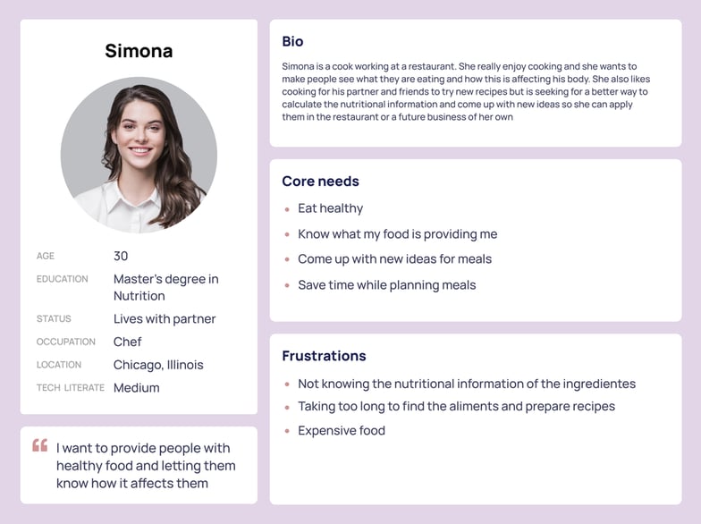 Problem Statement: Simona is a cook that works at a restaurant who needs A way to share with her customers the nutritional information of the food because Most people doesn’t know what they are really eating and how it affects them.
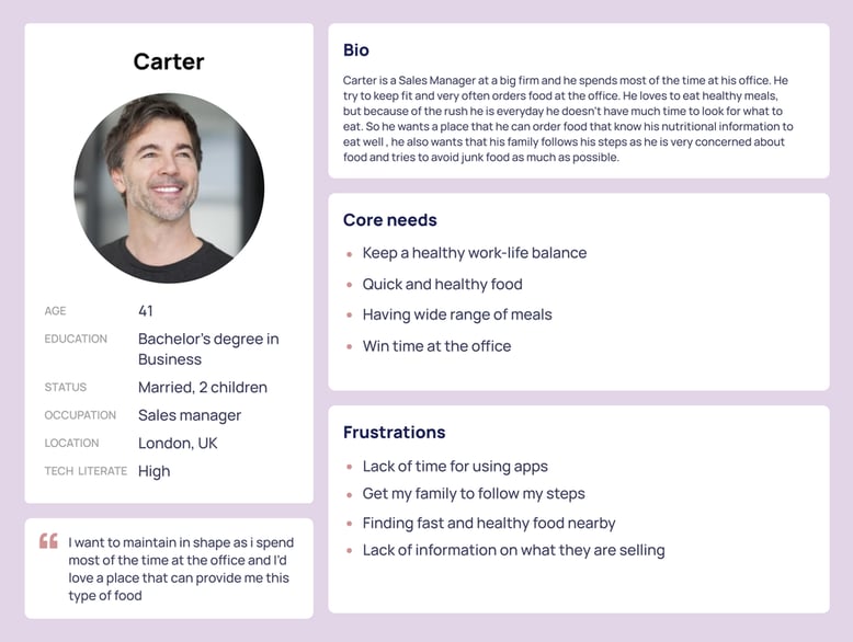 Problem Statement:Carter is a busy man that spends most of the time on his office and wants to keep fit and wants his family to do it too. He need a quick look for what to prepare for the next day instead of having to think about it
Ideate
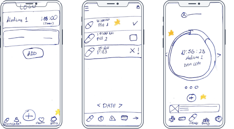
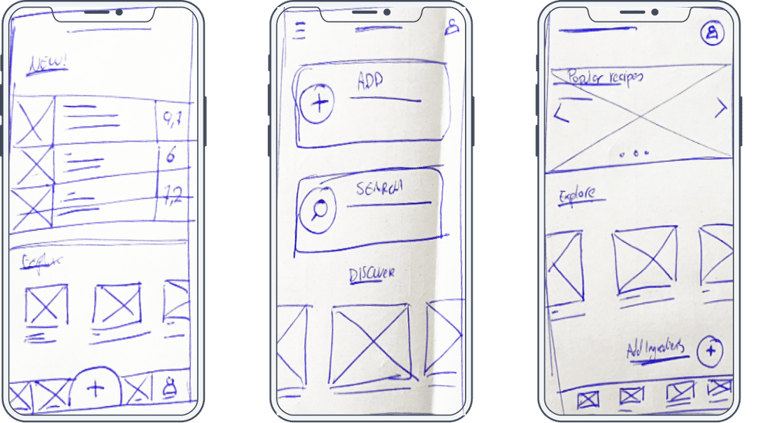
Sketches
In the sketching phase, I focused on creating a Home Screen that offers a wide range of features. I prioritized a bottom navigation bar with distinct tabs to provide users with easy access to the app's main functions. Visual elements were emphasized to make the design more attractive and user-friendly, ensuring a seamless and engaging experience from the start.
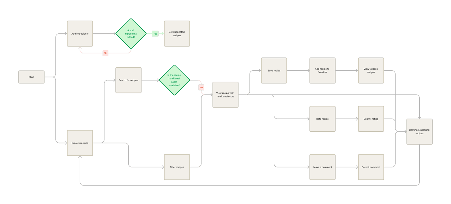
 Flow Chart
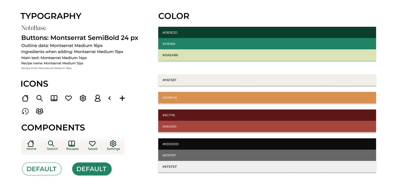
 Style Guide
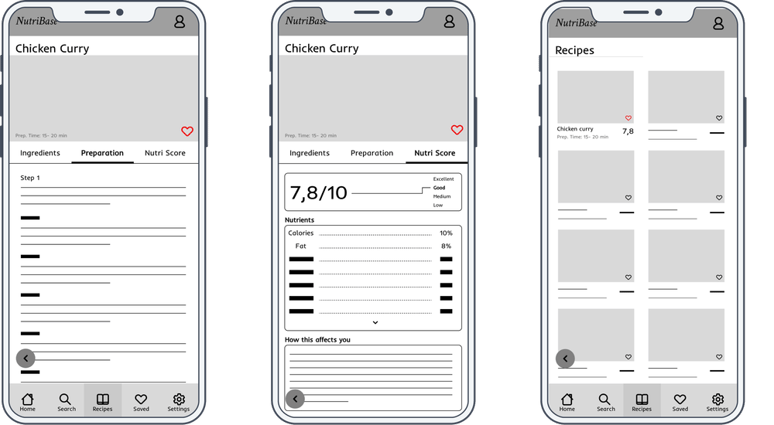
 Digital Wireframes
Move from paper to digital made it easy how the redesign could help address the user experience. I prioritize the user to make it reliable and accessible for everyone who will use it
Digital Wireframes
Move from paper to digital made it easy how the redesign could help address the user experience. I prioritize the user to make it reliable and accessible for everyone who will use it

Usability Study
- Study Type: Unmoderated Usability Study
- Location: Spain, remote
- Participants: 5 Participants
- Length: 10-15 minutes
Usability Study Findings
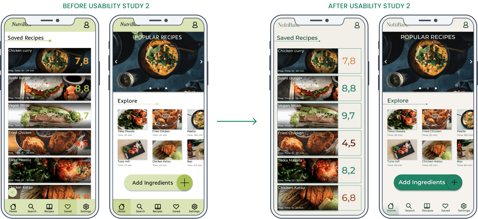
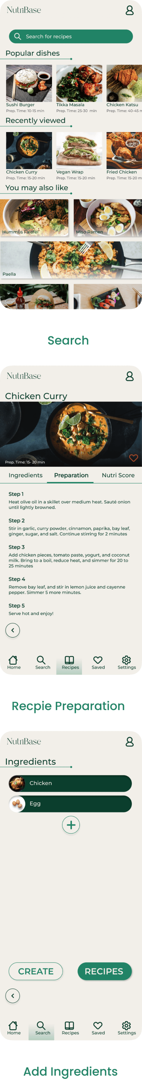
- Round 1: Users requested the ability to customize recipe portions and create their own recipes.
- Round 2: Feedback indicated a need for consistent save icons, a simplified "Add ingredients" functionality, and a browsing history feature.
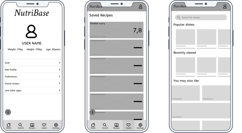
Design
📱 Mockups After Usability Study
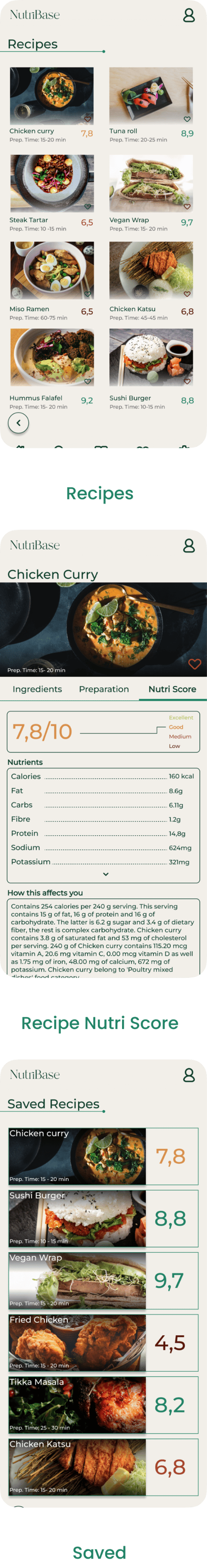
Post usability testing, the high-fidelity prototype was refined to address user concerns, resulting in cleaner user flows, improved navigation, and additional features like a search history and recipe customization.
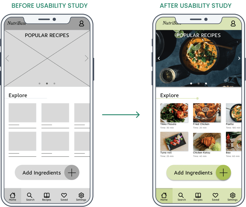 At first, I made the mockups quite similar to the digital wireframes, as I thought they were quite refined. I begin adding shadows and visual elements to emphasize the user experience. I chose a combination of green and white colors as a reflection of healthy colors.
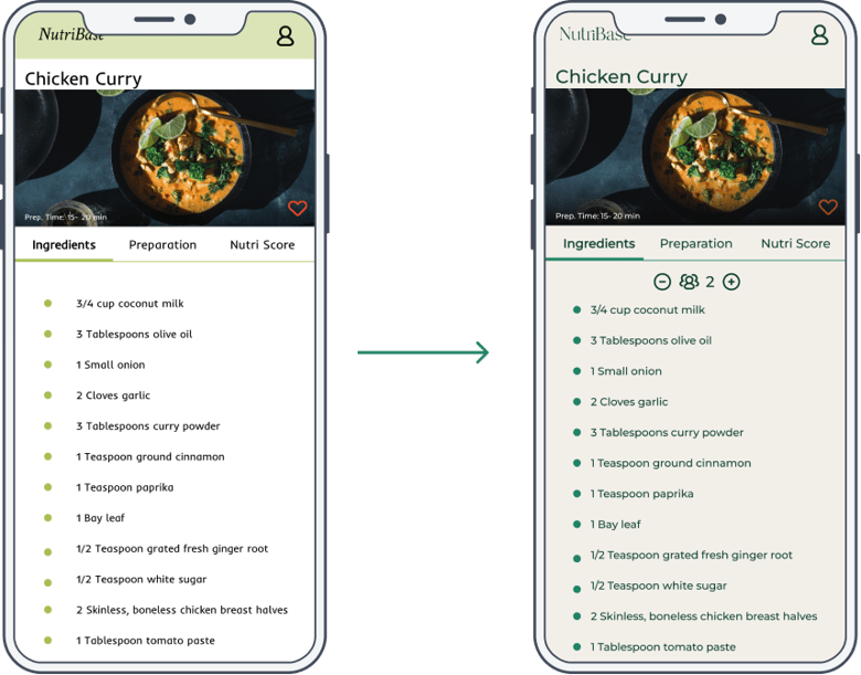
 Another feature that had the users worried was the quantity of the food when they saw a recipe. That’s why I added a people count to vary the quantity of the ingredients.
 After the second usability study, I began looking at the contrast ratio and the design of the entire app, and most of the contrast ratio didn’t meet the minimum. Some elements weren’t readable. That’s why I changed all the fonts to make it more readable and visually appealing. The color palette was also changed to ensure its simplicity and consistency.
Screens
After the second usability study, I began looking at the contrast ratio and the design of the entire app, and most of the contrast ratio didn’t meet the minimum. Some elements weren’t readable. That’s why I changed all the fonts to make it more readable and visually appealing. The color palette was also changed to ensure its simplicity and consistency.
Screens
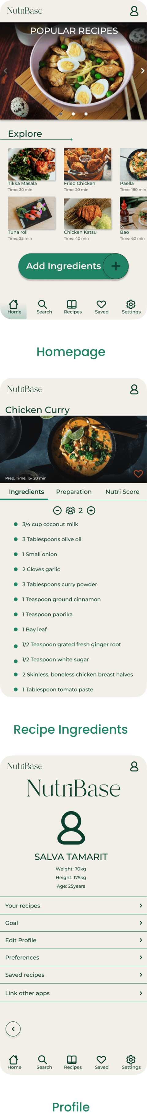
 Hi-Fi Version Prototype
Accessibility Considerations
🚀 Takeaways
Impact: Users felt that NutriBase significantly simplified healthy eating by providing clear nutritional insights and easy-to-follow recipes.- Used contrasting colors for readability.
- Integrated visual cues to assist in user navigation.
- Ensured one-handed operation for key functions, making the app accessible to all users.
What I Learned: Inspiration and feedback are key to overcoming design challenges and ensuring that user needs are fully met. 📈 Next Steps
- Conduct further usability testing to validate improvements.
- Explore new design inspirations for future updates.
- Monitor industry trends to identify opportunities for further enhancement.
I’m grateful to everyone involved in this project. Your insights and support were invaluable. If you'd like to see more or get in touch, my contact information is provided below.
Let’s work together!
If you have a project or a job opportunity in mind, I would like to hear from you.
You can find me on Linkedin or e-mail me at salva105@hotmail.com Made with love by Salva Tamarit
You can find me on Linkedin or e-mail me at salva105@hotmail.com Made with love by Salva Tamarit