Research
Visual Design
UI Design
UX Design
- Adobe XD
- Adobe Illustrator
- Adobe Photoshop
Overview
🎬 Project Brief
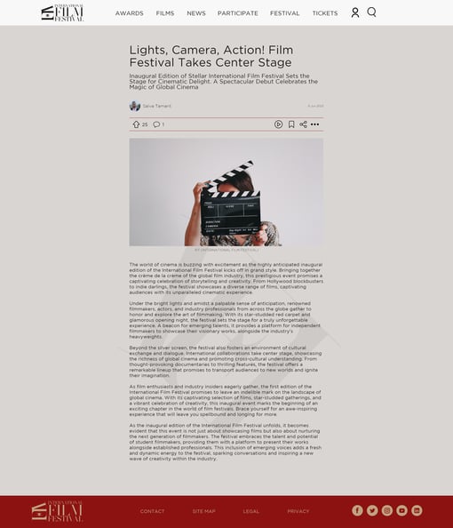
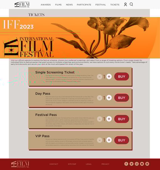
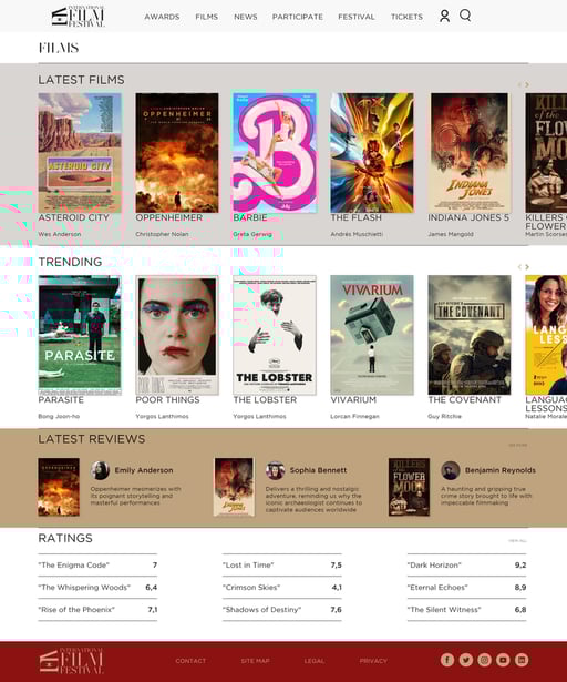
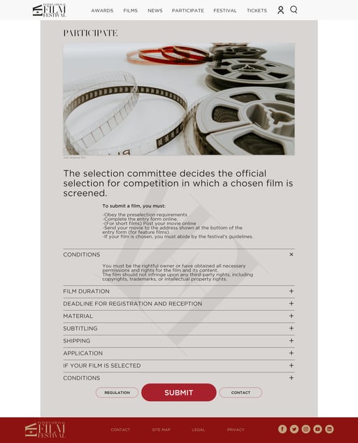
The International Film Festival (IFF) website brings together film enthusiasts and critics from around the world. It offers a platform where users can explore the latest films, participate in the annual award nominations, and cast their votes. The website integrates both jury decisions and popular opinions, making the film award process more inclusive and engaging for everyone involved.
⚡ Problem
Film enthusiasts and critics alike struggled to find a platform where their opinions could truly influence award outcomes. Traditional film festivals often overlooked the voices of the general public, focusing solely on jury decisions. This left many users feeling disconnected and unengaged, with no central place to discover films and participate in the voting process.
💡 Goals
- Create an inclusive platform where both the general public and film critics can contribute to the award nomination process.
- Enhance user engagement by providing a space for users to browse, rate, and vote on films.
- Streamline the user experience to make the process of discovering and voting on films intuitive and enjoyable.
🎯 Objectives
- Develop a user-friendly website that simplifies the process of participating in film awards.
- Ensure that users can easily navigate the platform, find relevant information, and cast their votes.
- Provide a showcase for films, giving them visibility and encouraging user interaction through ratings and reviews.
Design Roadmap
01
Emphatize
02
Define
03
Ideate
04
Design
- User Research
- Pain Points & Needs Identification
- User Interviews & Insights
- User Persona
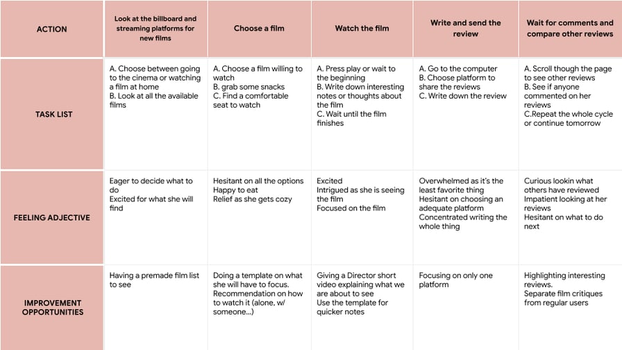
- Journey Mapping
- Wireframes & LoFi-Prototypes
- Usability Study
- Feedback & Iterative Improvements
- Brand/Visual Design
- HiFi-Prototypes & Mockups
Emphatize
User Research
I conducted user interviews and created empathy maps to understand the target audience's needs. The research revealed that users wanted to be part of the film voting process, feeling that their opinions were often overlooked in traditional film awards, leading to frustration and disengagement.
Pain Points
Being Heard: Users felt their opinions were often ignored.
Clarity: Information needed to be clear and concise for easier navigation.
Usability: Existing platforms were complex and overloaded with information.
Platform Overload: Users were uncertain which platform to choose due to the abundance of options.
Define
User Persona & Journey
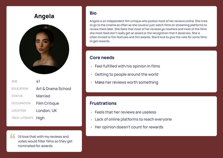
 Problem Statement: Angela, an independent film critic, needs a platform to share her reviews and ratings to influence film nominations because it makes her feel her opinion is valued.
Design
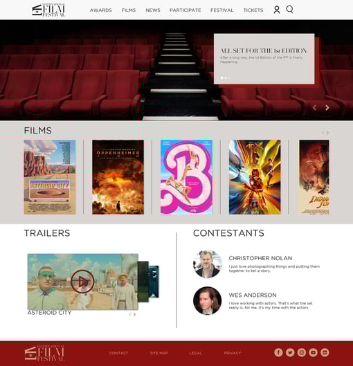
📱 Mockups After Usability Study
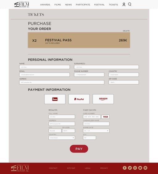
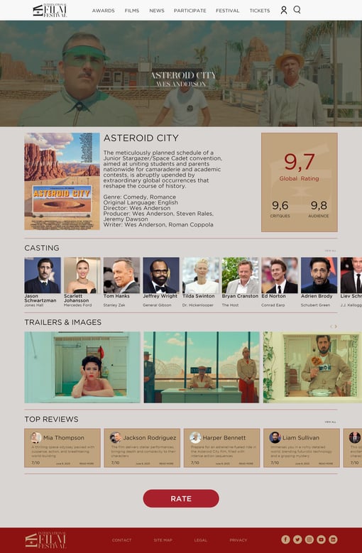
Based on the usability study insights, I adjusted tab sizes, standardized fonts, centered elements on the top bar, and added a cohesive brand identity.
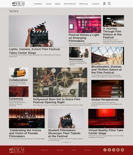
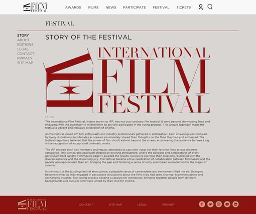
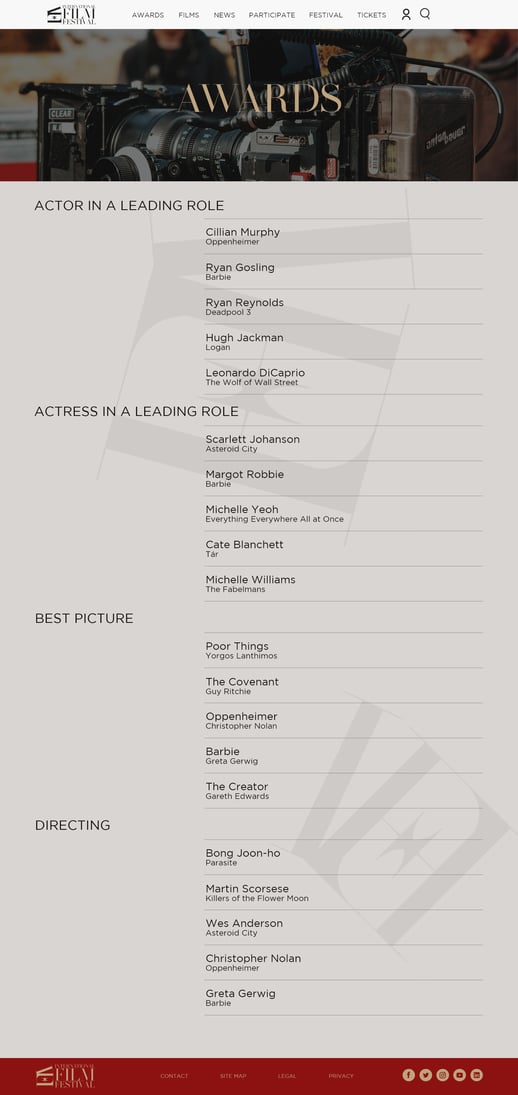
On the festival page, there was plenty of information so I divided the tab into sections to make it more easy for the user flow and not overcharged with information
Screens
 Hi-Fi Version Prototype
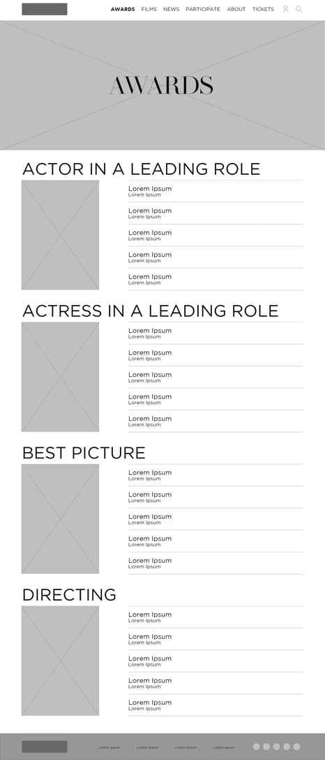
Before Usability Study
After Usability Study
Before Usability Study
After Usability Study


Accessibility Considerations
🚀 Takeaways
Impact: Target users found the design intuitive, engaging, and visually appealing, with a clear visual hierarchy.- Used different-sized headings for clear visual hierarchy.
- Implemented landmarks for easy navigation.
- Added a screen reader option for visually impaired users.
What I Learned: Even small design changes can significantly impact the user experience. Focusing on user needs and maintaining a cohesive design style throughout was crucial. 📈 Next Steps
- Conduct follow-up usability testing.
- Adapt the design for responsiveness on different devices.
- Identify additional needs and ideate new features.
Thank you to everyone involved in this project. If you’d like to see more or discuss potential collaboration, please reach out—I'd love to connect.
Let’s work together!
If you have a project or a job opportunity in mind, I would like to hear from you.
You can find me on Linkedin or e-mail me at salva105@hotmail.com Made with love by Salva Tamarit
You can find me on Linkedin or e-mail me at salva105@hotmail.com Made with love by Salva Tamarit